Controllers: A Playful Dingbats Font for Game-Inspired Branding
I opened a blank brand board last Tuesday—not for a tech startup or esports client, but for a small creative studio rebranding their workshop space and merch line. They’d asked for something “playful but grounded,” with subtle nods to analog creativity and digital craft. I reached for Controllers almost on instinct—partly because I’d just installed it, partly because its name made me smile. Within ten minutes, I’d dropped its icons into a logo concept alongside a clean sans serif, and suddenly the whole mood shifted: lighter, more tactile, unexpectedly warm.
What It Is—and What It Isn’t
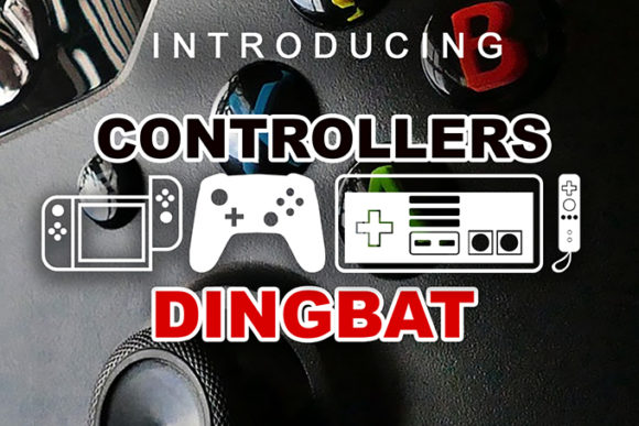
Controllers is a dingbats font—not a text face, not a script, not a headline typeface in the traditional sense. It’s a curated set of vector icons rendered as glyphs: PlayStation buttons, Xbox triggers, Nintendo D-pads, retro joysticks, cartridge slots, pixel hearts, even tiny game controllers drawn with charming, slightly uneven outlines. The style sits comfortably between hand-drawn charm and crisp digital precision—no heavy gradients or 3D effects, just confident, single-weight outlines with gentle curves and intentional imperfections. It feels like a sketchbook page that got digitized with care.
This isn’t a font you’ll use for body copy—or even for a tagline unless it’s three words max. It’s a decorative display font, built for moments where meaning lives in symbolism, not semantics. Think of it like a well-chosen icon set, but one that lives inside your typography workflow. You type “A” and get a controller; “B” gives you a pause symbol; “X” renders a classic cross button. No plugins, no SVG imports—just native font behavior.
Where It Shines (and Where It Steps Back)
I tested Controllers across six real touchpoints: a café’s limited-edition event poster, a handmade ceramics shop’s packaging label, a creative studio’s business card, a Shopify product page header, an Instagram story template, and a printed zine spread. Its strongest performance? On the ceramic packaging—a matte kraft box with a simple “PLAY” stamp in Controllers, paired with a warm, low-contrast serif for the shop name. At 18pt on uncoated stock, the icons held clarity and character without looking gimmicky. Same went for the business card: a tiny joystick glyph next to the studio’s website URL added instant visual texture without crowding.
On screen, it worked beautifully in hero sections and social banners—especially when scaled large (48pt+). But I quickly learned its limits: at under 14pt on web, details like trigger grooves or button seams start to blur. And forget using it for anything requiring multilingual support—it’s English-keyboard mapped only, with no extended Latin characters or diacritics. Also, no weights, no italics, no alternates. Just one clean, consistent weight. That’s not a flaw—it’s a feature. It keeps the voice focused.
Pairing It Without Overcomplicating
The magic of Controllers lies in contrast. I tried it with everything from Didot to Inter, and the most successful pairings shared one trait: they stayed out of the way. A sturdy, neutral sans serif (like Poppins or Work Sans) gave the icons room to breathe in logo lockups and web headers. For print-based editorial work—like that zine—I paired it with a relaxed serif (Cormorant Garamond, light weight), letting the dingbats act as chapter dividers or section accents. Avoid pairing it with other decorative fonts or busy scripts—the visual noise competes instead of complements.
One unexpected win? Using it alongside a subtle handwritten font for workshop signage. A chalk-style script for “Workshop Hours,” then a clean Controllers “▶” icon before the time. Instant rhythm, zero overdesign.
A Few Practical Notes Before You Commit
First: licensing. Controllers is a commercial font, and its license covers desktop, web, and app use—but check the fine print if you’re embedding it in templates, SaaS dashboards, or print-on-demand products. I always verify before sending files to a client’s printer or developer.
Second: file formats. It ships as OTF and WOFF2, so it’s ready for both design apps and modern websites. No webfont generator needed—just drop it into your CSS @font-face stack and go.
Third: testing. Don’t skip this. Drop Controllers into your actual layout—not just a mockup, but the real InDesign doc, Figma frame, or HTML prototype. See how it behaves at 16px on mobile, how it prints on your studio’s Epson, how it aligns with your primary typeface’s x-height. Dingbats fonts live or die by context, not concept.
Lastly: know when *not* to use it. Skip Controllers for formal B2B branding, healthcare materials, legal disclaimers, or any project where clarity, neutrality, or gravitas is non-negotiable. It’s not for every brand—but for the right one, it adds a spark of wit, warmth, and unmistakable personality that no stock icon set can replicate.
If you’re designing for makers, gamers, educators, indie studios, or anyone who values play as part of process—Controllers isn’t just another dingbats font. It’s a quiet, confident way to say: *this is fun, and that’s intentional.*